Color Psychology: How Wallpaper Colors Affect Your Mood

The Invisible Influence of Your Digital Environment
Ever notice how you feel an immediate sense of calm when opening a device with a soft, blue-toned landscape, versus a spike in alertness when faced with an aggressive, neon-red interface? You are experiencing color psychology in action, a design science that links visual stimuli to cognitive and emotional responses. Your wallpaper is the most visible element of your digital habitat; choosing it based on color science turns your screen from a simple background into a powerful tool for mood management.
Why Color Choice Matters in Your Digital Workspace
Our brains are hardwired to react to color, a remnant of our evolutionary past where specific hues signaled survival or safety. In a modern digital context, these reactions persist. A cluttered, high-contrast display can contribute to visual fatigue, whereas balanced, intentional color palettes can lower cortisol levels and maintain steady focus throughout the workday. Whether you are using a workstation for intense creative tasks or a mobile device for personal downtime, your screen's color composition acts as a silent background influence on your mental clarity and stress regulation. Curating your digital space with intentional color is not just about aesthetics—it is about optimizing your mental environment.

Tranquil Mountain Lake Landscape Painterly Wallpaper
This landscape features soft, muted blues and greens, ideal for desktop monitors where prolonged screen time occurs. Its painterly texture reduces eye strain by avoiding harsh, high-contrast edges.
Practical Guide: Aligning Color with Intent
To use wallpaper as a psychological tool, you must first identify your goal. Do you need to focus, relax, or feel energized? Here is how to map color to your specific needs:
- For Productivity (Cool Blues and Greens): Research suggests that blue tones facilitate focus and steady productivity by calming the nervous system. Green hues, reminiscent of nature, reduce eye fatigue and promote cognitive endurance, making them perfect for long spreadsheet sessions or intensive coding.
- For Energy and Creativity (Warm Oranges and Reds): If you are starting a brainstorming session or need a morning boost, look for warm tones. These colors act as mild stimulants, increasing alertness and creative spark. Use these for shorter sessions where you need to be quick and reactive.
- For Deep Relaxation (Dark Violets and Neutrals): When it is time to wind down, switch to dark, monochromatic, or deep purple themes. These colors signal to the brain that it is time to transition into a rest phase, effectively preparing you for better sleep hygiene.
Follow these steps to audit and improve your digital wall space:
- Define Your Primary Use Case: Identify if the device is a work machine, a relaxation tool, or a gaming hub.
- Check Your Lighting: High-brightness screens in dark rooms need darker, lower-contrast wallpapers to prevent glare and eye irritation.
- Limit Saturation: Extremely high-saturation images can be visually demanding. For primary workstations, favor muted, natural, or desaturated palettes to keep your focus on your open applications.
- Test for Visual Noise: Place your icons on the wallpaper. If they disappear into the background pattern, the wallpaper is too noisy; choose something with more negative space to keep your desktop organized.

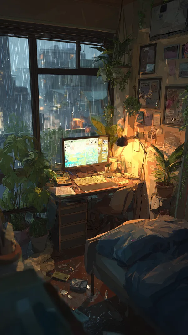
Cozy Rainy City Desk Scene with Lush Indoor Plants
The warm ambient light in this portrait-oriented image makes it an excellent choice for smartphones during evening hours, helping to shift your mood toward relaxation.
Featured Picks: Curating by Mood
Every wallpaper on Aiixy carries a different energetic signature. These picks highlight how specific color combinations create distinct environments for your devices.

Winter Wolf Pup Peeking from Snowy Rocks – Nature Wallpaper
The cool, crisp palette of this winter scene is perfect for wide desktop setups. It creates a 'cool' visual anchor that feels refreshing and helps keep you centered during high-stress hours.

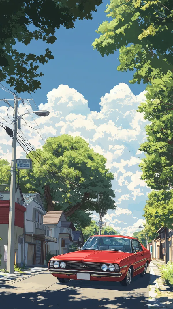
Vibrant Red Classic Car on a Sunny Suburban Street
The bold red of this classic car acts as an energetic focal point. Use this portrait wallpaper on your smartphone to provide a brief, high-energy pick-me-up throughout the day.

Mystical Purple Castle on a Floating Island at Dusk
Purple is known for stimulating the imagination and intuition. This floating island scene is an ideal backdrop for creative workstations where you need to push past creative blocks.

Coastal Hillside Village at Dusk with Warm Lightscape
The balance of deep blue shadows and amber golden lights in this image makes it a highly balanced choice. It offers enough warmth to be inviting without being overwhelming, perfect for a balanced, neutral workday.

Epic Panda Samurai in Ornate Armor in the Rainy Garden
The rainy garden setting combined with the grounded, earthy armor creates a mood of focused discipline. This is a great choice for a secondary screen to remind you to stay calm and methodical.
FAQ
Does wallpaper color really affect battery life?
Yes, especially on OLED and AMOLED screens. Using dark or black-dominant wallpapers significantly reduces battery consumption because the pixels are physically turned off or dimmed, preserving power over time compared to bright, white-heavy images.
What resolution do I need for a 4K display?
To avoid pixelation on a 4K screen, you should aim for a wallpaper with a minimum resolution of 3840 x 2160 pixels. Using a lower resolution image on a 4K display will result in 'stretching' artifacts that can make your workspace look messy and reduce clarity.
How do I make my desktop icons readable on busy wallpapers?
If you love a busy, colorful wallpaper but cannot read your icons, try right-clicking your desktop and adjusting icon text shadows or labels. Alternatively, consider choosing wallpapers that feature a blurred or out-of-focus background section where you typically place your most-used application icons.
Can I use these wallpapers for commercial projects?
Our library at Aiixy is curated specifically for personal digital use, such as smartphones, tablets, and desktop computers. Please refer to our site terms regarding licensing if you intend to use them for any broadcast, commercial, or public-facing digital display project.
How often should I change my wallpaper?
Changing your wallpaper every 2 to 4 weeks is a great way to prevent 'visual habituation,' where your brain stops noticing your screen and you lose the psychological benefit of the colors. A fresh background keeps your workspace feeling new and encourages a fresh perspective on your daily tasks.
Conclusion
Your screen is more than a window to your files; it is a vital part of your psychological architecture. Start by auditing your current setup, swapping out clashing colors for palettes that support your actual goals, and browse our full collection of curated, high-definition wallpapers to find the perfect match for your mood today.