The Art of Pastel: Curating a Calming Digital Environment with Soft Hues

Soft Tones, Big Impact: Why Your Screen Deserves a Pastel Refresh
Staring at a high-contrast, neon-drenched screen for eight hours a day can feel like a sensory assault. If you have ever felt your eyes straining or your stress levels climbing as you navigate a cluttered, high-saturation interface, you are not alone. There is a simple, elegant solution hidden in the color spectrum: pastel palettes. By shifting your digital environment toward soft, muted hues, you can fundamentally change your relationship with your devices, transforming them from sources of digital fatigue into beacons of calm.

Pastel Wildflowers by the Sea at Sunset – Calm Coastal Glow
This landscape-oriented piece is perfect for a wide desktop monitor, where the gentle blur and coastal gradients provide a tranquil backdrop that doesn't distract from your open windows or desktop icons.
The Psychology of Pastel Colors in Digital Design
Color psychology is a powerful tool in digital design. Pastels—those colors with high value and low saturation, created by adding white to base hues—carry a unique emotional weight. Unlike bold, primary colors that trigger urgency or excitement, pastels are scientifically linked to feelings of serenity, nostalgia, and safety. When you occupy a space—digital or physical—dominated by soft pinks, gentle mints, and pale lavenders, your brain receives subconscious cues that it is time to lower the guard, breathe, and focus.
For the modern remote worker or digital creator, this shift is vital. A harsh, bright screen keeps the nervous system in a state of 'high alert.' Conversely, a desktop wallpaper featuring muted tones acts as a visual 'reset button.' It reduces the overall luminosity perceived by the retina, effectively lowering eye strain and preventing the rapid onset of digital fatigue. When your background is soothing, your task-switching behavior becomes less chaotic, leading to improved concentration and a more measured approach to high-pressure work.

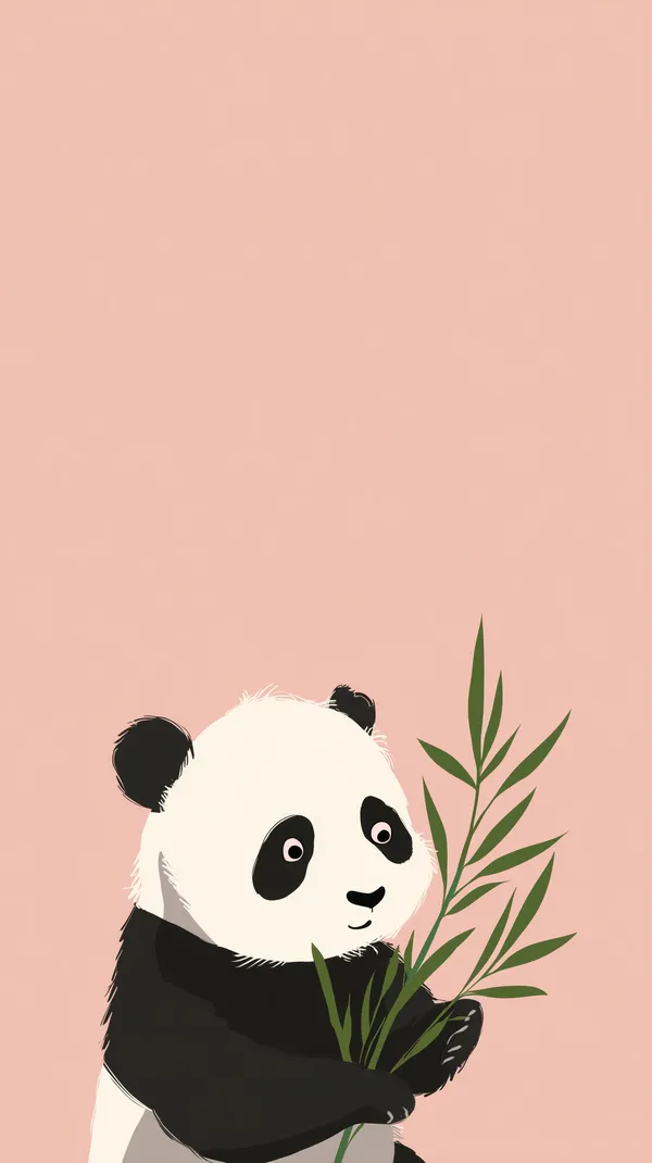
Pastel Panda with Bamboo Wallpaper - Cute Animal Art
This portrait wallpaper is an ideal candidate for mobile devices or tablet screens, where the vertical composition allows the minimalist illustration to frame your app grid with clean, breathing room.
How to Curate Your Pastel Setup: A Practical Guide
Successfully integrating pastel aesthetics into your workflow requires more than just picking a pretty image. It requires a commitment to visual harmony. Follow these steps to ensure your digital space is both beautiful and functional:
- Evaluate Your Lighting Environment: Pastels thrive in environments with soft, ambient light. If you work in a dark room, ensure your system's UI theme (Dark Mode) complements the specific pastel shades in your wallpaper.
- Audit Your Icon Layout: If your wallpaper is busy, keep your desktop icons to a minimum. Use a 'hide desktop icons' setting to allow the art to breathe, or group your files into a single, clean corner.
- Match Your UI Accents: Most modern operating systems (Windows 11, macOS, Android, iOS) allow you to change your accent colors. Use a color picker tool to sample the dominant pastel shade from your wallpaper and apply that to your system menus and button highlights for a cohesive, professional look.
- Prioritize Soft Focus: Avoid high-contrast imagery within your pastels. Look for wallpapers that utilize soft gradients or bokeh effects; these minimize the distraction caused by sharp edges behind your windows.

Whimsical Mushroom House in Dreamy Sunset Skyscape
Use this landscape image to anchor a dual-monitor setup; its horizontal expanse provides a continuous, dreamlike horizon that links your screens visually, creating a cohesive workspace environment.
Featured Picks: Curated Pastel Selections for Every Device
Choosing the right wallpaper is about matching the art to the device's usage. A mobile device needs clear focal points, while a desktop environment needs wide-angle, atmospheric compositions.
The Whimsical Desktop: Mushroom House
For those who love storytelling in their design, the Whimsical Mushroom House offers a dreamy sunset skyscape. It is an excellent choice for a primary desktop screen where you want a spark of creativity to fuel your morning productivity.
The Cozy Mobile Companion: Plush Bear

Cozy Plush Bear Holding a Pink Donut – Soft Wallpaper
The Cozy Plush Bear works exceptionally well as a landscape tablet background. Its warm, inviting tones serve as a gentle reminder to take a break during long reading or browsing sessions.
The Minimalist Vertical: Pastel Panda
When you need to keep your smartphone clutter-free, the Pastel Panda is your go-to. Its minimalist aesthetic and peach background provide the perfect contrast for dark text on apps like your calendar or to-do list.
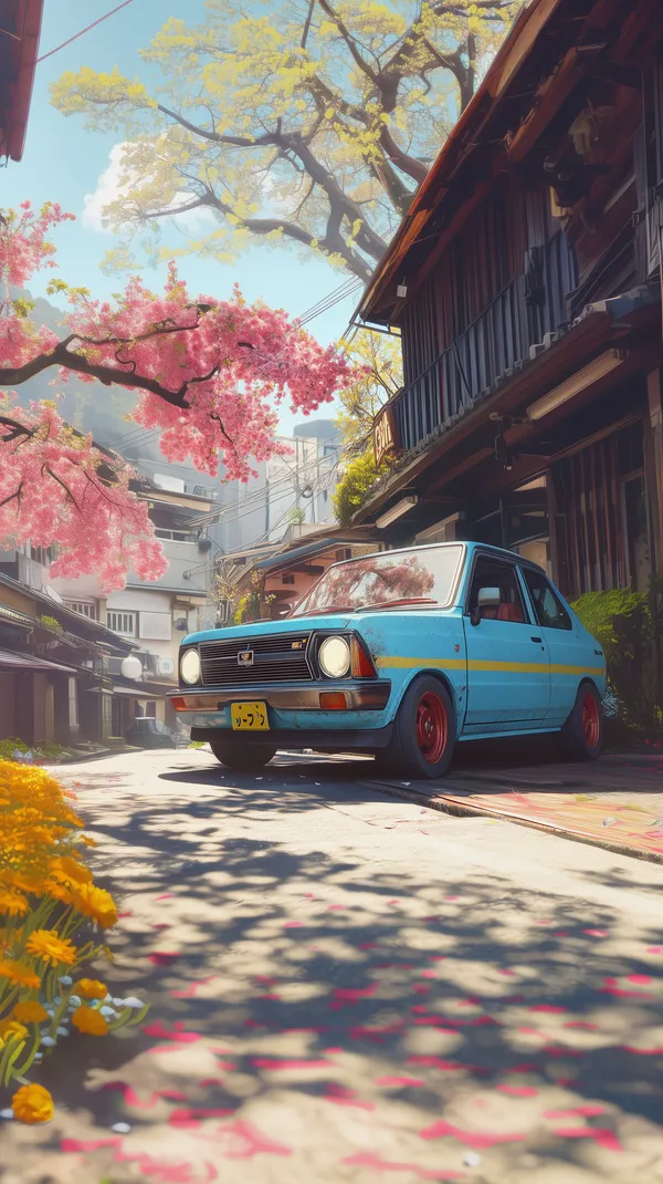
The Cinematic Street Scene: Vintage Blue Sedan

Vintage blue sedan on a sunlit street amid blooming trees
If you prefer a touch of nostalgia, this portrait-oriented street scene adds a layer of depth to a mobile lock screen. The blooming trees and soft sunlight create an uplifting visual anchor for your start-of-day phone checks.
The Sensory Experience: Ice Cream Scoop
For a high-resolution 4K desktop, the Creamy Pink Ice Cream Scoop provides rich textures and warm, soft lighting. It is best used on displays that support high color accuracy, as the subtle gradients will truly pop.
Frequently Asked Questions
Can I use these pastel wallpapers for my professional creative projects?
The wallpapers available on Aiixy are curated for personal use as digital backgrounds. We encourage you to use them to elevate your personal screen aesthetics, but they should not be redistributed or used in commercial design projects without explicit licensing.
What display resolution is best for 4K monitors?
For a 4K monitor, look for wallpapers with a width of at least 3840 pixels. Using lower-resolution files on a high-DPI display will lead to 'pixelation' and blur, which defeats the purpose of the crisp, soft-focus aesthetic we recommend.
Does a bright pastel wallpaper affect my device's battery life?
If you are using an OLED or AMOLED screen, lighter-colored wallpapers do consume more power because every pixel is actively illuminated. If battery life is a priority, consider using pastel designs that feature deeper, more muted tones or utilizing your device's power-saver modes alongside your background.
How do I make my icons more readable over a detailed pastel wallpaper?
If your wallpaper has a lot of texture, you can adjust the contrast of your system icons or add a subtle 'drop shadow' to your text labels. Alternatively, browse our collection for wallpapers with more 'negative space'—areas of solid color that allow text to stand out clearly.
Elevate Your Screen Experience
Your digital environment is an extension of your physical workspace, influencing your mood and cognitive performance every time you wake your screen. By selecting a high-quality pastel wallpaper, you are investing in a more intentional, calming, and visually satisfying daily experience. Explore our full collection of pastel-colored wallpapers to find the perfect shade for your setup and transform your screen into a sanctuary today.